From architecture and graphic design to everyday objects and digital imagery, Korean visual culture does not come from a single source. Centuries-old aesthetic traditions, rapid urbanization in the second half of the 20th century, and a creative culture increasingly connected with the wider world have come together to form Korea’s distinctive visual identity today. This article looks at how traditional colors and forms have entered contemporary design, how urban spaces have changed, and how graphic and digital expression have evolved.
Traditional Aesthetics Became the Visual Grammar of Korean Design
Color, form, and material carry layers of long-established aesthetic sensibility. To understand the roots of Korean design, it is natural to begin with obangsaek, the traditional five-color system. Made up of blue, red, yellow, white, and black, these colors were more than decorative choices. They formed a symbolic language associated with directions, seasons, and cosmic order. Contemporary designers rarely reproduce them exactly. Instead, they often lower the saturation or isolate individual tones for use in packaging design and spatial branding.
Negative Space and Proportion – The Spatial Sensibility Inherited From Hanok
The structure of the traditional Korean hanok places greater emphasis on balance than strict symmetry. Spaces arranged around a courtyard treat emptiness itself as part of the design. This sensitivity to negative space continues in contemporary graphic design and interiors. Clean layouts and generous spacing between visual elements reflect the same underlying approach.
Material Texture – Modern Interpretations of Hanji, Wood, and Ceramics
The translucent texture of hanji paper, the natural grain of wood, and the rough glazed surface of buncheong ceramics create distinctive visual and tactile impressions. Some brands digitally reproduce hanji textures in product packaging, while architects adapt traditional earthen-wall techniques for modern finishing materials. The preference for restraint over extravagance, and for the presence of the material itself over excessive decoration, remains central to Korean aesthetics.
Urbanization and Architecture Reshaped Korea’s Visual Environment
Postwar reconstruction fundamentally changed the appearance of Korean cities. During the rapid industrialization of the 1960s and 1970s, apartment complexes became the standard form of urban housing, while the skylines of Seoul and other major cities became filled with uniform concrete blocks.
Signage Culture and the Density of Commercial Districts
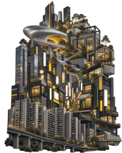
Commercial districts created visual excess in a different way. Streets in areas such as Hongdae, Myeongdong, and Gangnam became layered with hundreds of signs, forming a distinctive type of urban visual culture. This dense signage may appear chaotic, but in some respects it reflects the distinctive energy of Korean cities.
Cultural District Regeneration and Public Design
The direction began to change after the 2000s. The Seoul Metropolitan Government sought to improve the quality of public space through projects such as the restoration of Cheonggyecheon, Seoullo 7017, and Dongdaemun Design Plaza, or DDP. Designed by Zaha Hadid, DDP became an architectural statement of urban identity in its own right.
Cafés, select shops, and independent bookstores also became part of this movement. In neighborhoods such as Seongsu-dong and Yeonnam-dong, converted factories and older residential buildings now function as design showcases, attracting visitors from Korea and abroad. Architecture and interior design have effectively become part of the brand identity itself.
Hangul, Graphic Design, and Digital Culture Expanded New Forms of Visual Expression
With its modular structure, Hangul offers distinctive possibilities for typographic design. Because consonants and vowels are combined into syllable blocks, each character can be treated as a complete visual unit. This structure is increasingly used in branding, poster design, and other forms of visual communication.
Changes in Graphic, Editorial, and Packaging Design
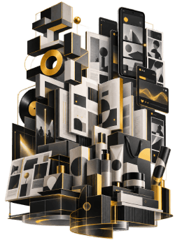
Since the 1990s, Korean publishing design has incorporated Western grid systems while developing its own ways of balancing the visual density of Hangul characters with negative space. The packaging design of cosmetics company Amorepacific has also attracted attention in international markets for its restrained color palettes and precise arrangement of information. In food and retail design, a refined aesthetic that removes unnecessary decoration has similarly become an established visual standard.
The Expansion of Visual Language Through Digital Culture
Social media and webtoon platforms have introduced new ways of producing and consuming images. Naver Webtoon developed an editorial format optimized for vertical scrolling, while K-pop album visuals and motion graphics have become important tools for building a consistent visual identity around individual idol groups. As the boundary between art and popular culture becomes increasingly fluid, Korean design has developed a distinctive visual language that is recognizable internationally.
Korean Design Makes Tradition and the Present Visible Together
The five colors of dancheong, the use of negative space in white porcelain, and the structural restraint of hanok architecture do not remain confined to museums as relics of the past. They continue to live within modern Korean graphic design, urban architecture, and digital visual culture, taking on new forms in each context.
Hangul typography transforms the geometric structure of the writing system itself into a visual language, while commercial spaces in Seoul attract attention by reinterpreting traditional aesthetics through contemporary spatial design. This is not simply a repetition of a national style. It is a process of reading older forms again within the context of present-day life. The international recognition of Korean design is closely connected to this approach. Rather than reproducing tradition unchanged, Korean designers combine long-established aesthetic sensibilities with contemporary creativity, creating a distinctive visual language that resonates in global markets.